Marketing and Outreach
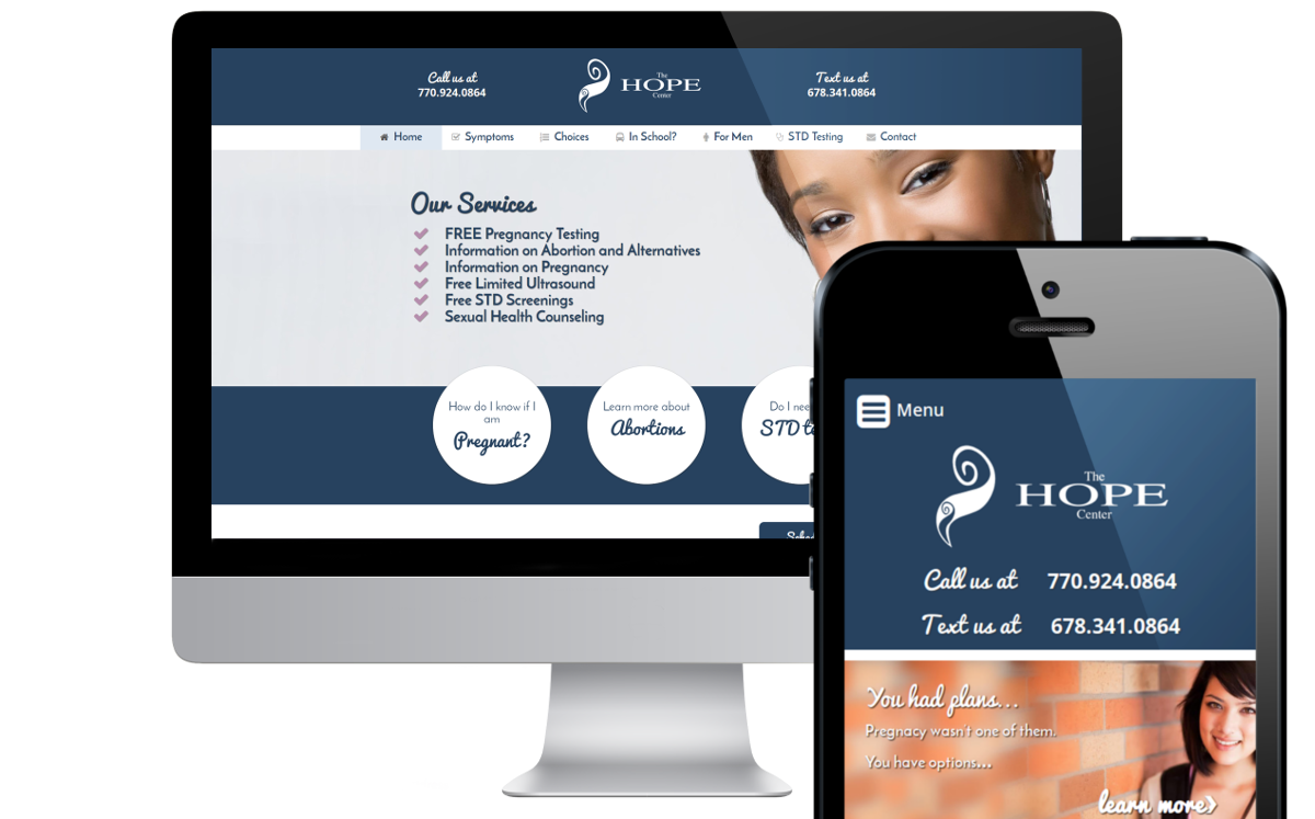
The primary goal of this project was to increase the reach of The HOPE Center to perform their primary mission, helping women with unplanned pregnancies. Unfortunately for them, their previous Website proved to be a major hurdle. The site itself was hosted by a third-party and did not allow them to alter the code at all themselves, and were very unresponsive about fixing some of the fundamental problems. It took nearly a year to have Google Analytics installed. It became very clear early in our discussions that a new Website would form the cornerstone for their future marketing efforts.
Modern, Clean Design
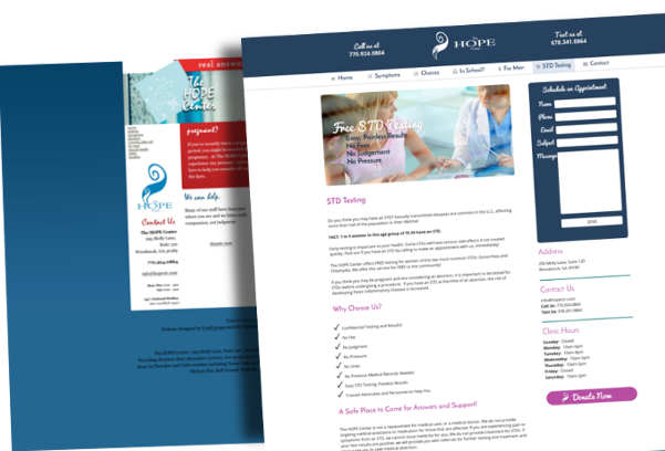
Considering The HOPE Center's primary audience, young women, we opted for a softer pallet, featuring a wider content region that focuses on content legibility and clear markers for quick scanning. We stepped up the content width from 850px to 1220px at the widest viewport. The extra width gives the content room to breath, even with the larger font size and offers a more comfortable reading experience.
Quick Results
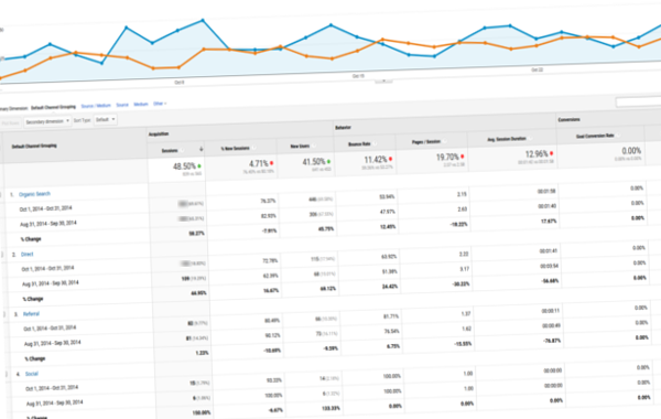
With expectations of the site being delivered prior to their annual meeting, we had a condensed timeline to design and deliver in one month. Within 30 days of launching, the site received 48% more traffic, 59% more from organic search alone. Much of the SEO benefit can be attributed to the new mobile-friendly design, reworked content, and leaner semantic markup.
Project Timeline
Rethinking Visitor Experience
We started by considering the target audience. How could we make a sensitive topic a bit more approachable? The home page should be warm and welcoming, and the experience should continue through each touch and moment during a visit.
Mobile Continuity
We made mobile a high priority, as most of their user base were mobile-first or mobile-only. The previous site addressed mobile using server-side redirection to a dedicated mobile site, which offered only a subset of content, contained out-dated information, and no access to edit it themselves. Knowing their audience is so dependent on mobile, we made it a very high priority with a beautiful responsive, mobile-first site. Now it is fast, easy to navigate, easy to read, and uses some mobile-only features for mapping, sms, and click-to-call.
Smooth Experience
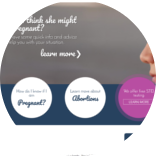
While we weren't completely rebranding, we wanted to modernize the experience, using a much wider view-port for large, high-resolution screens, engaging fonts, and smooth, but subtle CSS-based animations where appropriate. We maintained their brand's color and messaging, but completely rewrote their content.
On-time and On-budget
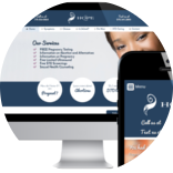
In the end, we delivered a shiny, new marketing platform that addresses all of their requirements, and offers much greater flexibility and control, which providing a superior user experience. On time and on budget. And did I mention the SEO benefits? Now that we have unique, well-written and well-structured content, and proper meta data, we've seen a nice increase in traffic in just a few short weeks.
